English
 русский
 عربى
عربى


Share
Our team is proud to offer on time guarantee and product guarantee to customer satisfaction.
Read More
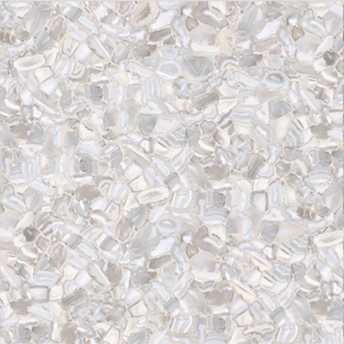
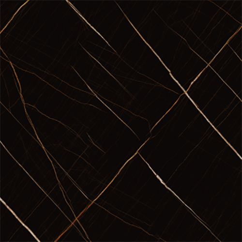
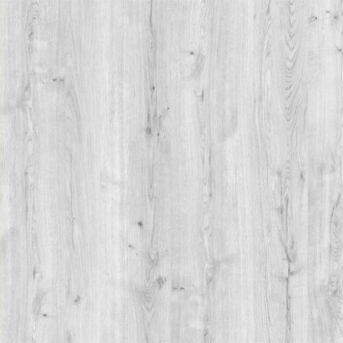
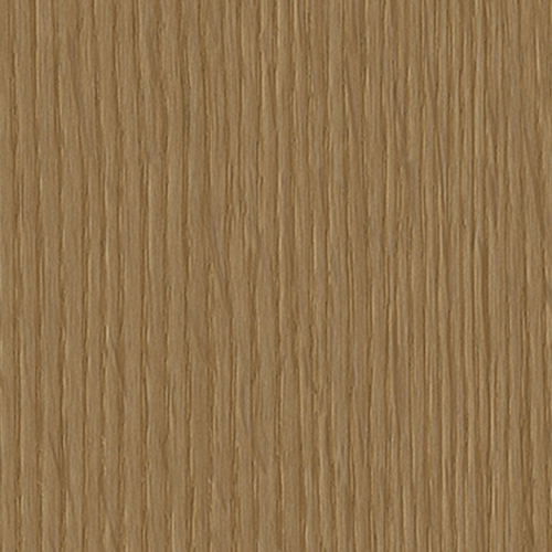
Decorative papers, especially solid color varieties, are versatile and widely used in crafts, scrapbooking, interior design, and packaging. While they may seem simple at first glance, the right combination of solid color decorative papers can create a vibrant and visually appealing result. The key lies in understanding color theory, contrast, balance, and the context in which the paper will be used. This article explores various strategies for matching solid color decorative papers to make them more colorful and dynamic.
1. Understand the Basics of Color Theory
Before diving into combinations, it’s essential to have a basic understanding of color theory. Colors can be categorized as primary (red, blue, yellow), secondary (green, orange, purple), and tertiary (colors formed by mixing primary and secondary colors). Additionally, the color wheel is divided into warm colors (reds, oranges, yellows) and cool colors (blues, greens, purples).
Color Harmony Principles:
Complementary Colors: These are opposite each other on the color wheel (e.g., red and green, blue and orange). They create high contrast and visual interest.
Analogous Colors: These are next to each other on the color wheel (e.g., blue, blue-green, green). They offer a harmonious and soothing effect.
Triadic Colors: Forming a triangle on the color wheel (e.g., red, yellow, blue), these combinations are vibrant yet balanced.
Monochromatic Schemes: Using different shades, tints, and tones of one color for a sophisticated look.
Applying these principles helps you choose color pairings that are both colorful and aesthetically pleasing.
2. Use Contrast to Create Visual Interest
Solid color papers don’t have patterns, so contrast becomes crucial. High-contrast combinations help differentiate elements and add depth.
Examples:
Pair a deep navy with a bright coral or hot pink.
Combine black with metallic gold or silver for an elegant touch.
Use light pastels (like mint or baby blue) against darker tones (such as charcoal or forest green).
Contrast not only adds vibrancy but also guides the viewer’s eye through the design, making it more engaging.
3. Incorporate Metallics and Specialty Finishes
Metallic decorative papers—gold, silver, copper, rose gold—add shine and dimension to any project. Even when using mostly solid colors, introducing one metallic sheet can elevate the entire palette.
Tips:
Use metallics as borders or accents.
Layer metallic papers under solid colors to create a glowing effect.
Combine matte and glossy finishes for textural contrast.
These specialty papers catch the light and bring life to otherwise flat compositions.
4. Play with Texture and Pattern Simulation
Since solid color papers lack printed patterns, texture can simulate complexity. You can use embossed papers, faux leather, linen-textured sheets, or even handmade textures like crumpled or torn edges.
Techniques:
Layer textured solids with smooth ones.
Use heat embossing techniques on plain paper to mimic patterned effects.
Try quilling, folding, or weaving techniques to add visual movement.
This approach transforms simple colors into dynamic components of your design.
5. Balance Warm and Cool Tones
Balancing warm and cool tones prevents the design from feeling too hot or too cold. A mix of both creates emotional balance and visual harmony.
Example Combos:
Warm: Burnt orange + mustard yellow
Cool: Teal + lavender
Mix: Coral (warm) + sky blue (cool)
This interplay makes the overall composition feel more colorful without overwhelming the senses.
6. Use Neutral Colors Strategically
Neutrals like white, gray, beige, and black act as anchors in colorful designs. They allow the brighter colors to stand out and prevent the design from becoming chaotic.
Applications:
Use neutral backgrounds to highlight bold colors.
Frame colorful sections with a neutral border.
Alternate between bright and neutral layers for rhythm.
Neutrals provide breathing space and ensure the final design feels cohesive.
7. Consider the Project's Purpose and Context
The intended use of the decorative paper plays a significant role in how you match colors.
Scrapbooking:
Use soft pastels for baby albums, bold primaries for children's themes, and earthy tones for nature-based layouts.
Interior Design:
For wall coverings or furniture accents, consider room lighting and existing décor. Bright colors can energize a space, while muted tones create calm.
Packaging:
High-contrast combinations attract attention on shelves. Think about brand identity and target audience.
Matching colors according to the project’s function ensures the result is both colorful and appropriate.
8. Build a Cohesive Color Palette
Creating a unified palette involves selecting a dominant color, a secondary color, and one or two accent colors. Here’s how:
Dominant Color: 60% of the design (main background or base).
Secondary Color: 30% (used for major elements or focal points).
Accent Color(s): 10% (for highlights, details, or small embellishments).
Using this rule ensures the design feels balanced yet colorful.
9. Experiment with Gradients and Ombres
Even with solid color papers, you can simulate gradients by layering similar hues in ascending or descending order.
How to Do It:
Choose five variations of a single color (from light to dark).
Arrange them side by side or in overlapping layers.
Alternatively, blend two complementary colors gradually across the layout.
This technique adds depth and movement, making the design feel more complex and colorful.
10. Test Combinations Before Committing
Before gluing or printing, lay out your chosen papers to test the color harmony. Take photos to see how the colors interact digitally, as screens often alter perception.
Tools to Help:
Color swatches or palettes from design software (Canva, Adobe Color).
Mood boards or Pinterest inspiration.
Physical samples arranged together.
Testing ensures that your final design looks intentional and polished.
11. Add Typography and Embellishments
Even the most beautiful color scheme benefits from thoughtful typography and embellishments. Use contrasting colors for text to ensure readability and impact.
Ideas:
Use black lettering on a yellow background for high visibility.
Stamp or handwrite quotes in coordinating ink colors.
Add stickers, ribbons, or die-cuts in matching tones.
These details enhance the color story and give the design personality.
12. Explore Cultural and Seasonal Themes
Colors evoke emotions and associations. Matching papers based on cultural meanings or seasonal changes can guide your choices.
Examples:
Holiday Themes: Red and green for Christmas, orange and black for Halloween.
Cultural Significance: Gold and red for Chinese New Year, saffron and green for Indian festivals.
Seasonal Palettes: Soft pinks and greens for spring, rich burgundy and navy for fall.
Aligning your color choices with familiar themes enhances the emotional resonance of your work.
13. Learn from Nature
Nature provides endless inspiration for color combinations. Observe sunsets, forests, flowers, and animals to discover organic and pleasing pairings.
Natural Inspirations:
Ocean blues and sandy beiges.
Autumn leaves: burnt orange, rust red, and golden brown.
Tropical fruits: magenta, lime green, and sunny yellow.
These combinations feel intuitive and inherently colorful.
14. Keep It Simple with Duotones
Sometimes less is more. A duotone scheme uses two contrasting colors to create a bold, clean look. This method works well for minimalist designs where color itself becomes the focus.
Popular Duotones:
Black and white (classic)
Navy and coral
Forest green and gold
Duotones are modern, chic, and surprisingly impactful.
15. Personalize with Emotional Resonance
Finally, don’t underestimate the power of personal preference. Choose colors that speak to you emotionally or remind you of something meaningful. Your passion will translate into the final piece, making it more vivid and expressive.
Matching solid color decorative papers to create a more colorful outcome is both an art and a science. By applying principles of color theory, contrast, and texture, and by considering context, purpose, and emotion, you can transform simple sheets into stunning visual stories. Whether crafting, designing interiors, or creating packaging, the strategic use of color turns the ordinary into the extraordinary. So go ahead—experiment boldly, trust your instincts, and let color lead the way.
We focus on environmentally friendly, healthy, and fashionable home decoration, making your living space shine with unique charm.
Copyright © Hangzhou Xinyue Decorative Materials Co., Ltd. All rights reserved.
Custom Decorative Papers Manufacturers